Designing product pages that work harder.
How I redesigned Stories & Ink’s product experience around clarity, trust and conversion — contributing to a record-high site-wide conversion rate.

Designing product pages that work harder.
Stories & Ink already had a distinctive brand, strong products and an established customer base. The opportunity was to make the product experience work harder, turning each PDP into a clearer, more convincing path from discovery to purchase.
The goal wasn't simply to redesign the pages. It was to rethink how product information, education, trust and brand storytelling could work together to help customers make a decision.
From product page to buying experience.
The existing PDPs contained much of the right information, but the hierarchy made it difficult to quickly understand what each product did, why it was different and why it was worth buying.
I approached the redesign around a simple question:
What does a customer need to know, see and believe before they're ready to buy?
That meant making descriptions easier to scan, bringing the strongest product benefits forward and creating clearer signals around quality, efficacy and trust.
It also meant thinking beyond individual sections. The entire page needed to feel like one connected buying journey across both desktop and mobile.
Building trust into the page.
For skincare, particularly a category as specific as tattoo skincare, education is part of conversion.
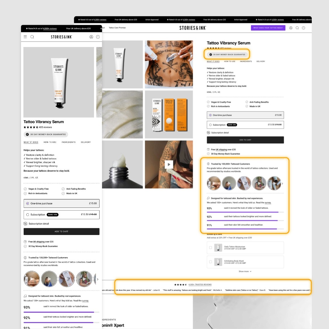
The new experience introduces stronger social proof throughout the journey, combining customer reviews with survey data and more visible reassurance around the products.
Rather than asking customers to simply trust what the brand says, the page gives them evidence from people already using the products.
Making the difference easier to understand.
One of the biggest opportunities was communicating why tattoo skincare should exist in the first place.
The redesigned pages put greater emphasis on customer outcomes and the specific needs of tattooed skin, moving beyond generic skincare language towards a clearer Stories & Ink point of view.
Product benefits, ingredients and education were reworked to support this positioning and make the reason for choosing Stories & Ink easier to understand.
Designed for the way people actually shop.
The experience was considered across desktop and mobile, with particular attention paid to hierarchy, scannability and the information customers need closest to the purchase decision.
Instead of treating mobile as a smaller version of desktop, the PDP was structured to make comparison, reassurance and purchasing feel natural on a smaller screen.
The result is a product experience that feels simpler while communicating considerably more.
The impact.
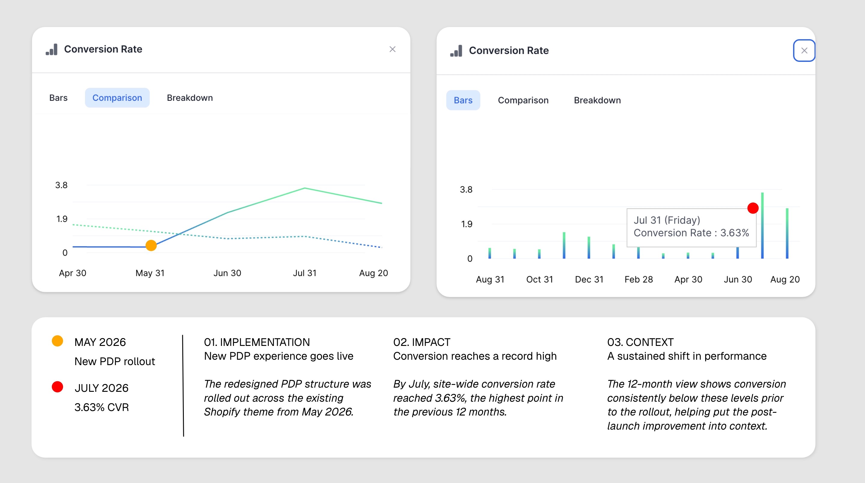
Following the rollout of the new product experience, site-wide conversion rate increased by 71.85% during the measured comparison period.
Net profit also increased by 70.17%, alongside improvements across several wider commercial metrics.
These are site-wide results and reflect the wider ecommerce and marketing activity taking place during the period, rather than the PDP work in isolation. But they point in the same direction: a stronger product experience formed part of a significantly better-performing ecommerce journey.
+71.85%
Site-wide conversion rate
+70.17%
Net profit
Better design should make the business work better.
This project wasn't about adding more content to a product page.
It was about understanding where customers needed clarity, confidence or proof, and using strategy, copy, UX and design to remove those barriers.
The result is a PDP system that better communicates the product, strengthens the brand and, most importantly, helps turn interest into action.
Scope
Ecommerce · CRO · Shopify · UX Design · Merchandising